Senator Elizabeth Warren recently announced a plan for Social Security reform. Among many other things, the plan includes one key provision that would be good for some very long-serving Massachusetts teachers and firefighters, but which would be bad for the rest of us.
Tucked inside the much longer plan, Warren writes:
My plan also ensures that public sector workers like teachers and police officers get the full Social Security benefits they’ve earned. If you work in the private sector and earn a pension, you’re entitled to your full pension and your full Social Security benefits in retirement. But if you work in state or local government and earn a pension, two provisions called the Windfall Elimination Provision and Government Pension Offset can reduce your Social Security benefits. WEP slashes Social Security benefits for nearly 1.9 million former public-sector workers and their families, while GPO reduces—and in most cases, eliminates—spousal and survivor Social Security benefits for 700,000 people, 83% of whom are women. [emphasis added]
The bolded section is a clever piece of writing. Let me explain. If you work in the private sector and earn a pension, you’re entitled to your full pension and your full Social Security benefits because you’ve been contributing to Social Security your whole career. If you work in state or local government and earn a pension, you’ll be eligible for your full pension and your full Social Security benefits if you contributed to Social Security your whole career.
Catch the distinction there? When Congress created Social Security, they made participation mandatory for private-sector workers, but optional for state and local governments. Today, about 25 percent of all state and local government workers are not covered by Social Security, including about 40 percent of teachers spread across 15 states. That includes Warren’s home state of Massachusetts, where teachers, firefighters, police officers, and other state employees are not covered.
When public-sector workers are not covered by Social Security, that means they don’t contribute the 6.2 percent payroll tax that all the rest of us pay. Their employers also do not contribute. As far as the Social Security Administration’s records are concerned, those workers basically do not exist. Someone else—the state pension plan—is supposed to be providing those workers with adequate retirement benefits.
But a problem arises when workers change jobs or move across state lines. If they have what’s called split coverage—meaning they work some years in Social Security and some years outside it—the Social Security formula would otherwise think they earned less income than they actually did. When it comes time to award their benefits, the Social Security formula would give them a more generous benefit than they truly deserve. (The same is true for spouses in households with split coverage.)
An example might help here. Consider two workers, Teacher A and Teacher B. Assume they both earn $50,000 a year for 40 years of work, for a total lifetime earnings of $2 million. Teacher A works her entire career in New York, where teachers participate in Social Security. The Social Security Administration collects taxes, and will pay benefits*, based on her entire $2 million in lifetime earnings.
Now consider Teacher B. She splits her career in two, half in New York and half in Massachusetts. She earned the same $2 million over her career, but the Social Security Administration only knows about (and taxed) half of that. When Teacher B goes to retire, Social Security would only see half of her lifetime earnings, the $1 million she earned in New York. Because Social Security offers more generous benefits to lower-income workers, the standard formula would replace a higher percentage of Teacher B’s earnings than it would for Teacher A.
Or, consider how Teacher B compares to other type of workers. Teacher B, the teacher with split coverage, would have the same Social Security earnings as someone who worked for the same length of time (40 years) but at half the salary (just $25,000 a year). Teacher B would also have the same Social Security earnings as someone who worked at the same $50,000 salary but for only half the time (20 years). Should Teacher B, with a Massachusetts state pension waiting for her and an extra $1 million in lifetime earnings, receive the same Social Security benefit as these other types of workers?
Congress said no. It decided giving Teacher B this type of “windfall” wasn’t fair. In response, it introduced the WEP provision to preserve the integrity of Social Security’s progressive benefit structure. (The WEP applies to individual workers, as in the example above, and the GPO applies to spouses in households with split coverage.)
To be fair, Warren is not the first Democrat to propose getting rid of the WEP and GPO. But Warren’s proposal stands out because of where she sits. That is, Warren is in a position to do something about this situation given her perch as a a senator from the state of Massachusetts and a member of the Senate Health, Education, Labor, and Pensions Committee.
Remember how the Social Security Administration ignores non-covered workers? It does so under the assumption that states will provide some basic level of retirement benefits in the place of Social Security. Congress wrote into law that if a state does not provide its workers with a retirement plan, then the state must join Social Security.
Unfortunately, Congress has paid little attention to what constitutes a suitable retirement benefit, and Massachusetts offers some of the worst public-sector retirement plans in the country. When the nonpartisan Urban Institute set out to grade state retirement plans, Massachusetts was the only state to earn an “F” grade. Other analyses have found similarly dreary findings for the state teacher pension plan.
Let’s say you’re a new teacher starting out in Massachusetts public schools this fall. Under the Massachusetts Teachers' Retirement System (MTRS), you’ll have to serve 10 years before qualifying for any pension at all. This 10-year vesting period would be illegal in the private sector, because Congress has imposed minimal requirements on company plans. There is no such protection in the public sector, and, according to MTRS’ own estimates, about two-thirds of new Massachusetts teachers will leave before reaching 10 years of service. They’ll have no Social Security and no pension to show for it.
But these early-career numbers do not get at the full scale of the problems. In a forthcoming paper, I compare MTRS benefits versus what Social Security would provide for the same years of service. These two systems could not be more different. Social Security’s benefit formula is progressive, and it offers more generous benefits to lower-income workers. In contrast, under MTRS, the longer someone serves and the higher the salary they earn, the higher the pension they receive.
When I compared these two benefit structures for new, 25-year-old teachers, I found that they would have to teach in Massachusetts public schools for 22 consecutive years before they would qualify for MTRS benefits that were at least as generous as Social Security. Due to its relatively high turnover rates, the vast majority of Massachusetts teachers will leave their service with retirement benefits that are not even as generous as Social Security.
THIS is the problem Senator Warren should be tackling. The people who lose out from the current arrangement are lower-income workers with comparatively unstable working careers. When the Social Security Administration ran the numbers recently, they found 19.6 million retirees with split coverage (aka they had some employment in non-covered roles). Out of those 19.6 million retirees with split coverage, 18 million of them faced no penalty from the WEP at all, because they didn’t stick around long enough to earn much of a pension in the first place.
That leaves about 1.6 million retirees who currently face some WEP penalty. But as the example above illustrated, these retirees are not exactly struggling. These are people who already earn moderate-to-large pensions from their state pension systems. In order for a Massachusetts teacher to even begin to face a WEP penalty, they would have to work at least 10 years in MTRS and at least 10 years in a job covered by Social Security. In addition, the WEP includes a special rule whereby no one's Social Security benefit can be reduced by more than half of their pension. That rule ensures that WEP only applies to people with pretty sizable pensions.
To be clear, the people affected by WEP aren't exactly wealthy--we are talking about teachers and firefighters and other public employees here--but they also aren't the most needy. They already receive a moderate-to-large pension from their state plan, and it wouldn't be fair to also reward them the “full” Social Security benefit provided to lower-income people.
Instead of ending the WEP and GPO altogether, Warren could pursue a few intermediate responses. As a Senator and a member of the HELP Committee, she could push the Social Security Administration to take a closer look at state retirement plans in states without Social Security coverage, like Massachusetts, to ensure the benefits they provide are at least as generous as Social Security. That’s not happening today. Warren could also sign on to other legislative proposals that are seeking to improve, not end, the WEP and GPO.
For example, there's nearly univeral agreement on the need to fix the mechanics of how the WEP and GPO get applied. Currently, the Social Security Administration relies on individuals to self-report whether they have a pension and how much that pension is worth. Inevitably, there are errors in this process. In 2017 alone, the Social Security Administration estimated it spent $870 million in "over-payments," and the WEP and GPO were the main contributors to those administrative errors.
This implementation timeline is also a problem for individuals. The Social Security Administration only applies the WEP and GPO when someone goes to retire and files for their benefits, and that moment represents a rude wake-up call for would-be retirees, who are suddenly told they will receive less than they might have otherwise expected. The lack of transparency turns into an unpleasant financial shock (and, I suspect, a big part of the hatred toward WEP and GPO).
The most sensible way to solve all of these problems, and get rid of the WEP and GPO provisions in the process, would be to make Social Security coverage mandatory for all. No more split coverage, no more surprises for workers, no more complexity. Full Social Security benefits for all. If Senator Warren wants to provide a real benefit to the teachers and other public servants who need the most help, she should focus on extending Social Security to all public-sector workers who currently lack it.
*This example is over-simplified, but technically, Social Security benefits are based on a worker's highest 35 years of earnings, adjusted for inflation.
In the retirement world, the Florida Retirement System (FRS) is often held up as a model for other states. But while it is in better shape than most other states, Florida could still do more to help its teachers save for retirement.
Florida is often praised on two fronts. First, compared to other states, it has managed its finances reasonably well. FRS has a funded ratio of 84 percent, compared to 73 percent for the median plan nationwide.
Second, Florida has been a leader in providing employee choice and portability. Beginning in 2002, it allowed new teachers to choose between a traditional pension plan or a portable defined contribution plan, called the FRS Investment Plan. After realizing that the portable option was likely the best choice for most teachers, in 2017 Florida shifted the default to automatically enroll new teachers in the FRS Investment Plan, while still allowing incoming teachers a choice over which plan was best for them.
However, the FRS Investment Plan has one critical flaw. Namely, its contribution rates are too low.
As of this school year, the official employer contribution into the FRS Investment Plan for “regular employees” like K-12 teachers is listed at 8.47 percent, but only 3.3 percent actually goes into member accounts. The state takes out a chunk for paying off the pension plan’s unfunded liabilities (3.56 percent of each teacher’s salary), a portion goes toward retiree health benefits (another 1.66 percent of salary), and assorted administrative fees make up the remainder.
Combined with a mandatory 3 percent employee contribution, that means Florida teachers are saving 6.3 percent of their salary toward retirement. Even with Social Security on top, that won’t be enough for most workers. Experts generally recommend that workers save at least 10-15 percent of their annual salary every year while they work in order to afford a comfortable retirement.
It’s possible that Florida teachers are making up the difference on their own, through 403(b) accounts or IRAs or other investment vehicles. But why doesn’t the state set up its teachers for success, rather than leaving it to chance?
The simplest way to do that would be to raise the default employee contribution rate to 5 or 7 percent instead of its current 3 percent. Many teachers would simply follow the default, but the state could allow anyone who wanted to lower their contribution rates back down to 3 percent to do so.
Even if Florida didn’t want to “nudge” teachers in this way, they could at least allow teachers to save more through the FRS plan. Florida teachers seem to like the FRS Investment Plan—and they should, it’s well-run, offers low-cost mutual funds, and features annuity options to help workers spend down their assets in retirement—but they aren’t allowed to save more in FRS even if they want to. Again, Florida teachers may be putting aside additional money elsewhere, but the 403(b) market is rife with bad actors selling teachers high-fee insurance plans. Just by opening up its own plan, Florida could make its teachers better off.
Florida policymakers have already taken several steps to boost the retirement security of its teachers. But a few more tweaks could help even more.
Taxonomy:When I was a kid, I worked at a local 9-hole golf course. It wasn't fancy. We didn't even take reservations, but we were the cheapest course in town and, inevitably, there would be times when we'd be so busy our customers would have to wait. On a few occasions like this, frustrated patrons would come up to us and ask how to get to the other golf courses around town.
The owner was proud of his course, and he hated hearing this particular question. So whenever he heard someone ask how to get to one of his competitors, he would boom out, "YOU CAN'T GET THERE FROM HERE!"
Clearly this was a preposterous answer. We weren't even located on a cul-de-sac, and anyone could simply retrace their steps and take a different road to a new destination. But that was part of my boss' little joke. His thunderous line didn't always work, but it did confuse and startle some customers into reconsidering and staying put to wait it out.
I think about this gambit a lot, because I often hear pension advocates use the same "YOU CAN'T GET THERE FROM HERE!" refrain. They'll often deploy it in response to data showing that teacher pension plans provide a secure retirement to only a small fraction of incoming teachers, and that those same plans have accumulated more than $500 billion in unfunded liabilities. The latest example comes from a paper written by Tyler Bond and Dan Doonan and published by the National Institute of Retirement Security (NIRS). The paper is ostensibly about what happened when states like Alaska, Kentucky, Michigan and West Virginia closed their defined benefit pension plans, but the paper's argument essentially boils down to saying that state-run pension plans are in such bad shape that they need new members to bail them out, and we must continue with the status quo forever.
On finances, Bond and Doonan argue that closing a poorly funded pension plan does nothing to pay down existing unfunded liabilities. This is true, but it ignores how the pension plans accumulated those unfunded liabilities in the first place. As Max Marchitello wrote in a recent report looking specifically at the case of West Virginia, when the state closed its defined benefit pension plan, it did little to address the plan's existing unfunded liabilities. The state still had to pay down those debts, and it largely failed to do so. But rather than blaming the state for accumulating those debts in the first place, or for failing to pay them off in a timely fashion, Bond and Doonan try to pin the blame on the shift to a defined contribution plan. That's a clever rhetorical trick designed to distract us from the question of whether the state's pension plan was good for the state or the majority of its teachers. (It wasn't.)
Similarly, Bond and Doonan attempt to argue that Alaska has trouble recruiting and retaining teachers because of its shift away from a defined benefit pension plan. But the authors neglect to mention that Alaska has always had trouble recruiting and retaining teachers. When we looked at the data on teacher turnover rates in Alaska over time, there was no visible effect of the retirement plan change. Teacher turnover was high in Alaska when they offered teachers a defined benefit pension plan, and it remains high now that new teachers are enrolled in a defined contribution plan. This finding squares up with what we've seen in other states as well; teachers just aren't that responsive to changes in their retirement plans.
Just like my former boss, pension advocates are using the "YOU CAN'T GET THERE FROM HERE!" refrain to scare legislators from asking tough questions about their state's pension plans. While responsible policymakers should be mindful of the effects of any potential change, and they should protect the promises made to current teachers and retirees, legislators should not be deterred from designing better solutions for the future. Ideally those plans would provide all new teachers with a path to a secure retirement.
Taxonomy:Most people probably don’t realize not all workers are covered under Social Security. In particular, teachers constitute one of the largest groups of uncovered workers. Nationwide, approximately 1.2 million teachers (about 40 percent of all public K–12 teachers) are not covered under Social Security for their time in the classroom.
How did we get here?
Why are some teachers covered, and others aren’t?
As Leslie Kan and I write in our 2014 report, the exclusion of teachers from Social Security comes from decisions made decades ago. State workers were left out of the original Social Security Act in 1935, initially because of concerns whether the federal government could tax state and local governments. Later when states were given the opportunity to extend coverage to public sector workers in the 1950s, most states chose to extend coverage. A handful of states, however, chose not to. Instead, these states bet they could provide better benefits through their state pension plans alone than through the combination of a pension and Social Security. Indeed, pension benefits for full-career workers typically have a higher rate of investment return than Social Security. However, this arrangement works well only for the small percentage of teachers who stay 30 or more years in a single retirement system.
Today’s reality is that half of all new teachers will not stay long enough to qualify for a pension at all; and for those who do qualify, many will receive pensions worth less than their own contributions. For teachers in states without Social Security coverage, they're at risk of leaving their public service with very little in the way of retirement savings.
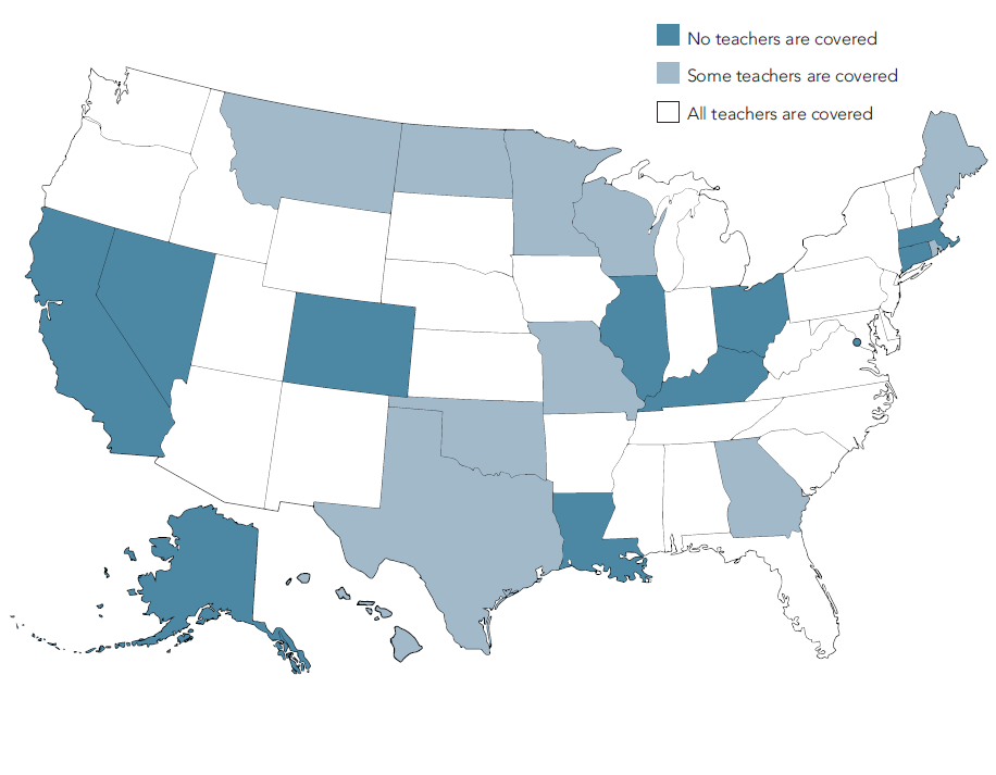
Today, the majority of uncovered teachers work in 15 states (Alaska, California, Colorado, Connecticut, Georgia, Illinois, Kentucky, Louisiana, Maine, Massachusetts, Missouri, Nevada, Ohio, Rhode Island, and Texas) and the District of Columbia. Additional states have varied coverage where some teachers remain left out.
Social Security Coverage for Teachers
Source: National Education Association, "Charteristics of Large Public Education Pension Plans."
Social Security coverage varies within states and sometimes even within districts. In California, almost all state government employees, state legislators, and judges are covered by CalPERS and Social Security. Teachers enrolled in the California Teachers State Retirement System (CalSTRS), however, are not covered by Social Security. Within California schools and districts—superintendents and district employees tend to be covered by Social Security, whereas classroom teachers tend to be uncovered.
States aren’t locked into keeping their teachers out of Social Security. When Social Security coverage was extended to the states in the 1950s, each state entered into what is called a Section 218 agreement with the Social Security Administration, detailing the extent of coverage. Today, federal law allows any state or local retirement system to modify their Section 218 agreement and join the program (states that opt into coverage can’t subsequently opt out). Certain states have state-level legislation that prohibit teachers from extending coverage, but most states do not have these barriers.
This provides an opportunity for states to reconsider their decades-old decisions. While not sufficient as a stand-alone benefit, Social Security could provide teachers with a floor of secure, inflation-protected, and portable benefits – something many teachers don’t have and genuinely need.
To learn more about teachers and Social Security coverage, read our report or watch the video below:
Earlier this month I wrote a piece showing how state pension formulas exacerbate teacher salary gaps across districts. Due to the way pension benefits are calculated – relying so heavily on salary and experience – a pay disparity between teachers with the same number of years of service will be compounded in retirement. Moreover, pensions are yet another way that more money is spent on educating students in low-poverty districts than in high poverty ones.
In this piece, I will tackle how experience in state teacher pension formulae can deepen existing school funding inequities.
Higher teacher turnover rates are not evenly distributed among districts or states. High poverty and rural districts tend to have higher teacher attrition. Indeed, high-poverty districts have been shown to lose teachers at nearly twice the rate as low poverty districts. Practically speaking, this means that less money is spent on both teacher salaries and pensions in low-income communities than in more affluent ones.
Deeper Dive into Turnover in West Virginia
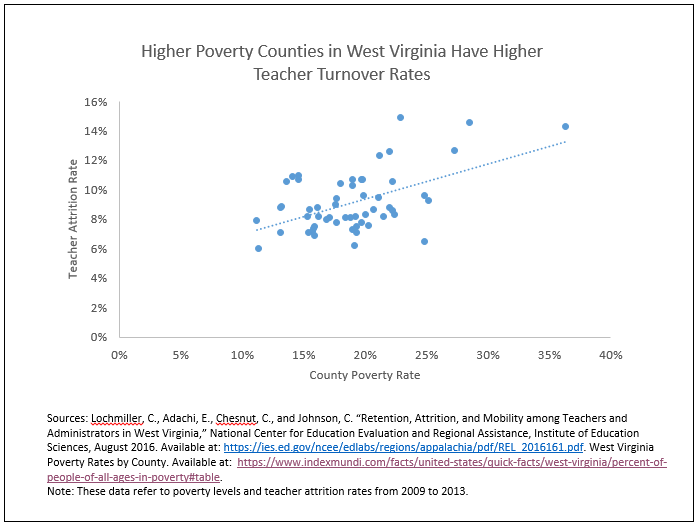
Let’s look at how this plays out in West Virginia, a state pension system I’ve written about a lot recently. As shown in the graph below, as a county’s poverty rate increases, so does the average teacher attrition rate.
Of course some of that turnover is due to retirement. However, the fact remains: counties with higher attrition rates are likely to have greater concentrations of new, and inexperienced teachers. And importantly, newer teachers have much higher turnover rates than their more tenured colleagues.
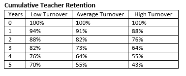
Consider the following hypothetical example of three school districts with different turnover rates based on West Virginia’s average attrition rate described above. I set the yearly low-and high-turnover rates at a third above or below the average rate of 9 percent. While teacher turnover tends not to be this linear – with very high attrition in the first year – the idea is to show how different turnover rates, and thus levels of experience in a district, affect school finance. The table below shows my results. After five years, the low-turnover district will have lost about 30 percent of its new teachers, compared to the high-turnover distirct, which will have lost 57 percent of its teachers. In a state like West Virginia with a five-year vesting period, low-turnover districts could easily have about twice as many teachers qualify for a pension than in high-turnover districts.
High turnover districts in West Virginia, and indeed across the country, disproportionately serve low-income students and communities. Those vacancies are often filled with new teachers who themselves are more likely leave the profession after only a few years. As a result, high poverty districts have a disproportionate share of newer teachers who earn lower salaries and less valuable pensions. Ultimately, due to variable retention rates, less money is spent to educate students in high poverty districts than in more affluent ones.
How Teacher Turnover Interacts with State Pension Systems to Affect School Finance Equity
Teacher pensions are calculated based on two key factors: years of service and salary. The longer a teacher stays in a classroom the greater her pension wealth will be. This is because salaries and experience interact: teachers with more experience typically earn higher salaries.
School districts with higher teacher turnover will have less experienced teachers earning lower salaries and thus qualifying for less valuable pensions. In other words, less money will be spent in the aggregate on teacher compensation in districts with high teacher attrition. This pattern exacerbates existing school finance inequities since districts with high teacher turnover also tend to serve low-income communities.
The problem is likely worse than a first glance suggests. This is because many teachers in high-turnover districts will leave the profession before qualifying for pension benefits at all, not to mention serving long enough to reach the valuable back-end benefits. This adds to the problem of high-turnover, and often low-income districts spending less money on total teacher compensation and thereby less on educating their students. Often the largest source of teacher turnover in low-income districts is from teacher "movers," who go on to teach in a different district. Although these teachers keep their state pension benefits, they add churn to the districts they leave, which can negatively affect students.
There is no easy solution to this problem. Teachers leave the classroom for any number of reasons. However, state policy makers should understand the ways their policies interact and look for ways to minimize both the impact that can have on teachers’ ability to save for retirement, and funding disparities between high-and low-poverty schools.
Taxonomy:This may sound counter-intuitive, but here it is: Technically speaking, Ohio school districts do not contribute toward Ohio teacher pension benefits.
"How is this possible?" you might ask. After all, Ohio school districts are contributing 14 percent of each teacher's salary into the pension fund.
But wait, where is that contribution going? If you pull up the latest actuarial valuation report from the State Teachers Retirement System of Ohio, you can find out. Table I-1 shows that the plan estimates the "normal cost" of the benefits are worth 10.91 percent of salary. That is, across all individuals who enter the plan, after accounting for their age or how long they might stay, the plan thinks the promised pension benefits are worth an average of 10.91 percent of each teacher's salary.
You'll quickly start to screw up your face, especially if you know that every teacher is currently contributing 14 percent of their salary into the plan. Fourteen is more than 10.91 percent, how can that be?
This is due to the fact that Ohio STRS has accumulated unfunded liabilities of $24.8 billion. Every single STRS member is contributing 3.09 percent of their salary (14 percent - 10.91 percent) to pay off that debt.
That's not all. In addition to the employee contributions, school districts are also paying in 14 percent of each teacher's salary into STRS. That money is going into the plan, but none of that is going toward benefits. All of it is going to being used to pay down the unfunded liabilities.
In essence, Ohio has created a system where teachers, on average, are getting less out of their pension plan than they themselves put in. To be honest, it's hard to even call this a "retirement" system at all. The system is functioning like a debt accumulation tool and a tax on teachers, with retirement benefits on the side.
Again, this may be sort of hard to wrap your head around, but it's true. The figures above are all based on what the state's actuaries think the Ohio STRS plan will cost over time. Ohio is the only state in such a bad situation overall, but Illinois teachers hired as of 2011 are also paying more into the system, on average, than the state's pension plan thinks their benefits are worth. Other states may be in similar territory for new, less-generous benefit tiers, but they rarely report those data separately.
In contrast, Ohio also offers new teachers the option to join a defined contribution plan with a 9.53 percent employer match. For the vast majority of teachers, that's likely to be the better option.
Taxonomy: