Stagnant teacher salaries have been a source of political consternation in recent months. Striking teachers in five states have pointed to low salaries as a key reason for walking out. Meanwhile, Los Angeles teachers are threatening to strike as well, and Miami voters will be deciding on a big increase for teacher salaries this fall.
While teachers make less money than similarly educated professionals in other fields, another claim often made by teachers is that their salaries have seen no improvement over the last few decades. They point to average teacher salaries, which have declined by $630 in real dollars since 1991, to bolster their claims. However, average teacher salaries alone do not tell the full story of what’s happening to teacher compensation.
Chad Aldeman explains this concept in more detail here, but to summarize, declining average teacher salaries may reflect changes in teacher cohorts rather than an actual decline in compensation for teachers at any given point in their career. Young, newly-hired teachers are paid less than experienced teachers. For this reason, if one experienced teacher retires and is replaced by a first-time teacher being paid an entry-level salary, average teacher salary declines despite the fact that no teacher’s pay was cut. This means that lower average teacher salaries don’t necessarily indicate worsening conditions for teachers. Instead, they could indicate that the profession has become more mobile.
Another way of looking at teacher compensation can be found in state teacher pension plans’ actuarial valuations. These publications include a list of assumptions used to estimate the plan’s future payouts, including assumptions for teacher salary growth rates. These assumptions are compiled through regular observations of what’s happening in the state, meaning that the salary growth rates should closely mirror the actual experiences of teachers at the time.
These salary growth rate assumptions can tell us a lot about how teacher compensation has changed over time. If the growth rates are going down, that means that teachers’ salaries are not growing at the same pace as they used to, bolstering claims that teachers are losing out.
So, do these salary growth rates tell the same story as declining average teacher salaries? Unfortunately, the overall answer appears to be yes. Not all states report the data every year or keep their reports online, but we took a random sample of five states (Arkansas, Connecticut, Michigan, Missouri, and Texas) with actuarial data going back to at least the mid-2000s. Each state’s nominal salary increase assumptions demonstrated a marked decline, and four out of five states saw decreases in real growth rates as well.
One way of visualizing this change over time is to look at how real salaries that started at the same level would progress over a career as each state’s assumptions changed. For example, here’s a graph of what a Missouri teacher’s salary growth would look like over a 30-year career after each revision of the state’s actuarial assumptions over the last decade, keeping their starting salary constant at $40,000:

In 4 of the other 5 sampled states, the graphs look similar to Missouri’s. In every state but Connecticut, real teacher salary growth is lower now than it was in the mid-2000s*. By the end of teachers’ careers, these differences translate to thousands of dollars less in real yearly salary:
In Arkansas, a teacher who began her career with a salary of $40,000 in 2004 would have been expected to make $95,824 after 30 years. Today, she would be expected to make $79,384.
In Connecticut, a teacher who began her career with a salary of $40,000 in 2004 would have been expected to make $61,538 after 30 years. Today, she would be expected to make $74,988.**
In Michigan, a teacher who began her career with a salary of $40,000 in 2002 would have been expected to make $143,676 after 30 years. Today, she would be expected to make $140,272.
In Missouri, a teacher who began her career with a salary of $40,000 in 2007 would have been expected to make $88,361 after 30 years. Today, she would be expected to make $74,648.
In Texas, a teacher who began her career with a salary of $40,000 in 2006 would have been expected to make $82,052 after 30 years. Today, she would be expected to make $63,361.***
There’s one big caveat here: we don’t know how average starting salaries have changed over this timeframe. Even if salary growth rates are decreasing, it’s possible (although unlikely) that a large simultaneous rise in average starting salary could mitigate the slower growth.
That being said, there’s reason to believe that these declines really do signal a worsening of teacher pay. For one, it corroborates what we're seeing in the trends in average teacher salaries. In addition, despite education budgets increasing in many states over the last decade, these declines in salary growth are coming at the same time that benefit costs are ballooning massively, eating more and more into the money that could be available for teacher salaries. As contributions to unsustainable teacher pension and health benefit plans continue to rise, many cash-strapped municipalities are facing impossible choices between paying teachers what they deserve or maintaining adequate funding of other core services.
Sadly, it’s hard to see these declines reversing themselves in the near future. Benefit spending will continue to ramp up over the next few years in most states. And if teacher salaries have declined throughout a period of economic expansion, it’s frightening to imagine what might happen if another recession hits and budgets are slashed. Nevertheless, we owe it to our teachers—and our students—to find the money to ensure that teachers are compensated in ways that fully reflect their worth and skill.
*Years vary based on data availability and when the states updated their assumptions.
**Although Connecticut’s nominal salary growth rates have declined, the state lowered their inflation assumption from 4% to 2.75% over the same time period. For this reason, assumed real salary growth is higher today than it was in the mid-2000s.
***Texas reports separate salary increase assumptions for men and women until 2008. The pay growth rate used in 2006 is for women only and is slightly lower than the growth rate for men. This means that the fall in average salary increase over this time period is actually slightly greater than what is reported above.
Taxonomy:We know that America has widening income inequality. The rich are getting richer, and wages have been stagnant for everybody else.
We also know that fewer Americans have access to defined benefit pension plans, putting more of the burden of saving for retirement on individual employees.
Are these two trends compounding each other? The short the answer is no, this is not happening. As I argue below, this is mainly due to our investments in progressive programs like Social Security and Medicare. The transition from defined benefit to defined contribution plans has been going on in the background, and it may seem at first blush like this transition could increase inequality, but that would be a misread of how the plans work.
First, consider the logic. Both defined benefit and defined contribution plans award benefits as a percentage of salary. Consider two workers in the same firm, a low-paid manual labor and a higher-paid executive. If, over time, the salary of the executive rises faster than that of the manual laborer, their retirement wealth will also become skewed as well. But crucially, this would happen in direct proportion to the change in salaries, regardless of plan type. Under either a defined benefit or a defined contribution plan, the executive gets a higher retirement benefit in direct relation to his or her higher salary.
If anything, the above example might be under-selling things a bit, because it assumes both types of workers stay with their company for the same length of time. Traditional defined benefit pension plans reward both high salaries AND long tenures, and we know that higher-paid executives have much more employment stability than lower-paid manual laborers. In this scenario, the manual laborer would be better off in a front-loaded defined contribution plan than a back-loaded pension plan.
The politics of this are confusing, since liberals tend to be the ones defending defined benefit pension plans, but there’s nothing special about them in this regard. Traditional pension plans are not inherently progressive. In fact, so-called “teacher” pension plans tend to reward higher-paid school administrators over more transient, lower-paid teachers.
Ok, enough with the theory, what do the data show? Retirement wealth is a function of participation and contribution rates. Once you combine both types of plans, workers are no more or less likely today to participate in a retirement plan than they were 30 years ago (see Figure 20 here), and total retirement savings has also kept pace. That is, the type of retirement plan has not dramatically changed our collective retirement preparation.
In terms of results for individuals, earlier this year I wrote about a paper from Adam Bee and Joshua Mitchell from the U.S. Census Bureau. Among Americans age 65 and older at the 25th percentile in terms of income, they found income gains of 31 percent from 1990 to 2012. For those at the 75th percentile, the gains were similar, at 32 percent. They also found that poverty rates among those 65 and older declined from 9.7 to 6.7 percent. To be sure, these stats do not prove that there is no inequality in retirement wealth, only that we’ve provided retirees with some buffer against it.
Namely, Americans over age 65 have a giant social safety net through Medicare and Social Security. To show just how important Social Security is, consider the chart below, from the Federal Reserve. The first two columns show that the top 5 percent of households have about 13 times the income as the bottom 50 percent of households, and about 110 times (!) the retirement wealth in the form of DB and DC retirement plans. That is, wealthier people have much more in the way of retirement assets than lower-income people. This has always been true, and income inequality is making these trends worse. But look at the last column, which compares total retirement wealth (including Social Security) with income while working. As a ratio of retirement wealth to wealth while working, the bottom 95 percent is doing ok, mainly because of Social Security.

Unlike our other forms of retirement savings, Social Security is explicitly designed to be progressive, and it is effectively providing a floor of retirement benefits and keeping retirees out of poverty. It’s possible that defined benefit or defined contribution plans could be designed more progressively. Defined benefit plans could provide a floor of benefits to all workers, for example, or award proportionately higher benefits for lower-paid workers. Defined contribution plans could be framed in terms of level-dollar amounts for each worker, as opposed to a uniform percentage rate which benefit higher-paid workers more.
But these elements are rare, and in fact the opposite is more common, where stable workers get extra rewards for their stability and transient workers lose out. In the teacher space, many states give extra perks to teachers or administrators who reach thresholds like 20 or 25 years of service. Those are another way states have made their teacher pension plans regressive, not progressive, and they're not even effective as retention tools. Worse, more than 1 million teachers don’t have access to Social Security, leaving them particularly vulnerable to poorly designed retirement plans.
All told, fewer older Americans have defined benefit pension wealth, and the poverty rate among elderly Americans has fallen dramatically. Both things can be true at once.
As we have written about before, female educators in Illinois earn on average $7,775 less than their male colleagues. This disparity in salary translates into average annual pensions that are $3,800 less valuable. In a recent blog post, I found that at least some of the salary and pension gap is derived from the fact that most female educators work in elementary schools, which have lower average salaries compared with high schools where most men work.
In this post, we will look into whether different rates of educational attainment among men and women contribute to the salary gap. This is an important question since in most school districts teachers can earn a significant salary increase, the so-called “master’s bump,” once they earn their master’s degree.
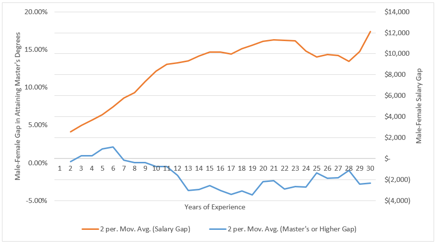
To do this, we looked at the rate of female and male educators who hold at least a master’s degree at each year of experience, and then we compared that trend to the salary data. In both cases, higher numbers correspond with a gap favoring male educators, while lower numbers represent a gap favoring female educators.
As shown in the graph below, there’s a gender salary gap (the orange line) even among educators with one year of experience, and the gap steadily increases over time, and growing to $12,567 among those with exactly 30 years of experience. The pattern on educational attainment (blue line), on the other hand, shows a different trend: women tend to hold master’s degrees at slightly higher rates at most experience levels.
Educational Attainment Rates do not appear to Influence the Gender-Based Salary Gap
Source: Author’s analysis of data from Illinois Teacher Service Record (TRS) 2012. Data adjusted for cost of living using the Comparable Wage Index.
These data show that men with six or fewer years of experience have slightly higher educational attainment, but after that the advantage goes to women. One might expect that with higher educational attainment, women’s salaries would be higher. But no, men have higher salaries at every experience level despite having worse educational credentials. The higher rate of educational attainment for women is insufficient to overcome other barriers to higher salaries, such as working disproportionately at the elementary level.
In the end, educational attainment does not explain why there is a large and persistent pay gap between male and female educators in Illinois. We will further explore other features and potential explanations of the gender-pay gap in future posts.
Teacher pensions are complex. This post is a part of series to answer the most common questions we get. To submit yours, email us at teacherpensions@bellwethereducation.org -- we’ll try our best to answer.
One of the most common teacher salary questions is whether or not teachers get paid over the summer months. So, do they? Not the most satisfying of answers but, it depends. Teacher payroll schedules vary district-to-district: some allow workers to spread their 10-month salary over 12 months, while others don’t give any paycheck during the summer months, requiring teachers to budget, or in some cases, get a second job.
Below are the public teacher pay schedules for the nation’s 20 largest* districts (as of July 2018). To compile them, I checked state payroll offices for pay day calendars and information regarding summer pay. It was surprisingly challenging to pull some of this data, and I ended up having to call payroll offices to clarify in some cases. Some districts don’t make this information readily available until a teacher is officially in the hiring process, further demonstrating why this is such a common question.
In general, most teachers are either automatically paid throughout the course of a year or have the ability to opt into a program that redistributes their pay for them. But a few districts, like Montgomery County, Maryland and Charlotte-Mecklenburg, North Carolina, reported paying teachers on 10-month schedules.
District
Teacher Payroll Schedule
The City School District of the City of New York (New York)
Teachers are paid twice a month for 12 months.
Los Angeles Unified School District (California)
Teachers are paid once a month for 12 months.
City of Chicago School District (Illinois)
Some instructional roles are 10-month positions, others are 12-month. Twelve-month employees receive 26 checks a year, and 10-month employees receive 21 checks.
Miami-Dade County Public Schools (Florida)
Most teachers are paid on a 10-month schedule. A few specialized instructional roles work on a 12-month schedule and are compensated accordingly. Twelve-month employees receive 26 checks a year, and 10-month employees receive 21 checks. Ten-month employees may opt in to a deferred payment plan to distribute 10-month salary over 12 months.
Clark County School District (Nevada)
Teachers are paid twice a month for 12 months.
Broward County Public Schools (Florida)
Most teachers are paid bi-weekly on a 10-month schedule, but may opt into a Year Round Pay program to distribute 10-month salaries over 12 months. A few specialized instructional roles work on a 12-month schedule and are compensated accordingly.
Houston Independent School District (Texas)
Teachers are paid on a 12-month schedule. Twelve-month employees receive 26 checks a year.
Hillsborough County Public Schools (Florida)
Teachers are paid bi-weekly on a 10-month schedule, but may opt into an Extended Year Pay program to distribute 10-month salary over 12 months.
Orange County Public Schools (Florida)
Most teachers are paid bi-weekly (beginning on the third week of their work year) on a 10-month schedule. If requested on or before the last day of preplanning, 10-month teachers may opt in to a deferred payment plan. A few specialized instructional roles work on a 12-month schedule and are compensated accordingly.
School District of Palm Beach County (Florida)
Teachers are paid on a 12-month schedule. Twelve-month employees receive 26 checks a year.
Fairfax County Public Schools (Virginia)
Most teachers are paid once a month for 11 months out of the year -- a few specialized instructional roles work on a 12-month schedule and are compensated accordingly.
Hawai’i State Department of Education
Teachers are paid twice a month for 12 months.
Gwinnett County Public Schools (Georgia)
Teachers are paid on a monthly basis. The pay cycle begins in August and ends in July of the following year.
Dallas Independent School District (Texas)
Teachers are paid on a 12-month schedule. Twelve-month employees receive 26 checks a year.
Wake County Public School System (North Carolina)
Teachers are paid once a month for 10 months. Teachers may opt into a Summer Cash Savings Account program to redistribute their salary over 12 months.
Montgomery County Public Schools (Maryland)
Most teachers are paid on a 10-month schedule. A few specialized instructional roles work on a 12-month schedule and are compensated accordingly.
Charlotte-Mecklenburg Schools (North Carolina)
Teachers are paid once a month for 10 months.
The School District of Philadelphia (Pennsylvania)
Teachers are paid on a 12-month schedule. Twelve-month employees receive 26 checks a year.
San Diego Unified School District (California)
Teachers are paid twice a month for 12 months.
Similar to teacher pension systems, teacher salary schedules and payroll calendars can vary dramatically across state and district lines. This variance, coupled with the level of opacity around district’s individual policies, can impede teachers from making informed decisions about their careers.
*The Department of Education of Puerto Rico is the fourth largest school district. Teacher payroll calendars were not immediately available for the district at publication time.
How do teacher pension plans work?
Teacher pension systems can be quite complex. There are specific rules that vary state-to-state that affect any given teachers’ annual pension benefit after retirement. There are wider contexts to consider as well. For example, in some states teachers are not covered by Social Security, unlike most employees who can count on Social Security on top of their 401k or pension once they retire. Add all this together, and it can be challenging for teachers to have an accurate sense of how their annual pension benefit is calculated and, in the end, determine the value of their yearly retirement.
The first thing to know is that most states have a minimum number of years of service teachers must meet before they are even eligible for a pension, also known as a vesting period. As such, teachers must work a minimum number of years, often five or ten years, to actually qualify for a pension upon retirement. If teachers leave before meeting that threshold, when they retire, they’ll only receive the money they’ve personally put in and, in some cases, a bit of interest on that investment.
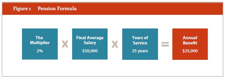
For those educators who work beyond the vesting requirement, traditional pensions are based on the teacher's years of experience and a measure of "final average salary," usually the average of the teacher's salary in the last three or five years prior to retirement. In general, the longer a teacher has worked and the higher her salary, the higher her pension will be. There is one more factor: a state-set benefit "multiplier," typically around 2 percent, that literally multiplies all of these variables together to determine how much a teacher will receive yearly during retirement.
The example below is a typical state pension structure and illustrates how teacher retirement benefits are typically calculated:
That's not all. States also set a minimum retirement age, before which teachers can’t access their pension benefits, and years of service requirements that teachers must meet to receive full benefits. For example, some states employ the "Rule of 80," which sets the retirement age as the point when the sum of an educator’s age and years of service add up to at least 80. States also set early retirement ages, at which point workers can collect reduced benefits. How much early retirement affects benefits varies by state.
Researchers have found that traditional teacher pension benefits are back-loaded in that most of their value comes as the teacher nears the normal retirement age. That happens because pension plans use the "final average salary" in the years they were earned; they do not adjust for inflation, and someone who leaves the profession years before collecting a benefit will see their pension gradually wear away to inflation. As a result, teacher pension plans typically provide generous retirement benefits only to those who teach for multiple decades. On the other hand, those with shorter careers receive scant, and in some cases, no pension benefit.
Here are a few other things teachers should consider when thinking about their retirement:
- What is the state’s vesting period? In other words, how long do you need to work before you will qualify for a pension?
- How much are you contributing per month to your pension? How much does the state contribute on your behalf on top of that?
- Are you enrolled in Social Security, or are you solely dependent on your pension and your own personal savings?
- If you’re a new teacher, does your state offer alternative retirement plans that might be more portable than the traditional pension plan?
Generally speaking, due to how pension systems are designed, only about half of teachers ever earn a pension. Instead, they only receive their own contributions made to the pension fund. Among those who do earn a pension, only those teachers who spend most of their careers working in the same state are the true "pension winners." Current and prospective teachers, particularly those living in states with other retirement options, should think carefully about which retirement saving strategy works best for them.
Even though most educators are women, their salaries nevertheless lag behind their male colleagues. In a recent report, I analyzed educator salary data in Illinois and found that women – at every experience level – earn lower salaries than men. On average, a female educator earns $7,775 less than her male colleagues. The problems don’t end there. These lower salaries translate to lower pensions as well. The typical female educator’s annual pension is valued at $3,800 less.
Unfortunately, finding a gender pay gap isn’t altogether surprising. However, it does mean K-12 education isn’t inoculated to gender-based disparities by district salary schedules that regulate how much educators can earn based on tenure.
So what might explain these gaps? Although there no perfect answers, through a series of posts I will look into potential causes. Today’s piece is about differences across grade levels.
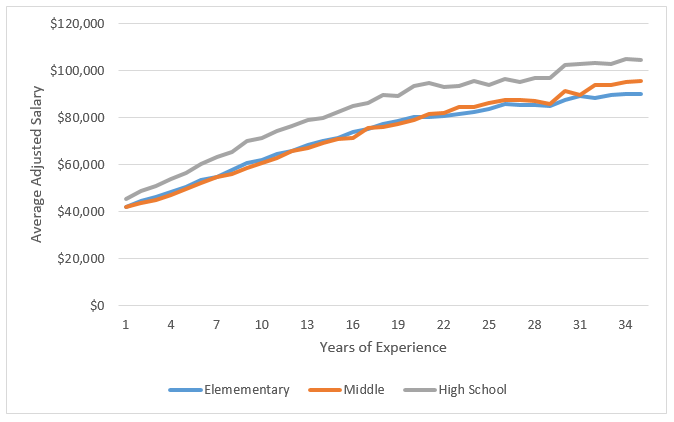
Aside from the “parenting penalty” that disproportionately and adversely impacts the earning potential for women, one reason women on average earn lower salaries and pensions is that they work overwhelmingly at the elementary level. The majority of men, on the other hand, work in high schools. As shown in the graph below, average salaries are significantly higher in high schools than in any other grade span.
High School Educators Earn the Highest Salaries in Illinois
Source: Author’s analysis of data from the Illinois Teacher Service Record (TSR), 2012. Data adjusted for cost of living using the Comparable Wage Index.
Around three-quarters of all educators in Illinois are women. And among women, 42 percent work in elementary schools, while only 17 percent work in high school. Comparatively, 47 percent of men work in high schools. This distribution contributes to the gender-pay gap among educators in Illinois. This may be due to greater extra earning opportunities at the high school level through clubs and athletics. Or, there could be a higher concentration of advanced degree holders in the upper grades. Illinois also has the most single-school districts in the country, which have significantly higher costs. It is possible that a disproportionate number of these districts may be comprised of high schools.
We will further explore features and potential explanations of the gender-pay gap in future posts.