Last week I wrote about a recent report from the Democrats on the Joint Economic Committee called “Retirement Security in Peril.” In my post, I narrowed in on some flaws in how the report talked about teacher pension plans. But after thinking about it a bit more, I wanted to zoom out and focus on some of the broader trends. I'm going to show four graphs to help illustrate exactly why the "retirement security crisis" put forward by the Democrats is almost exactly wrong.
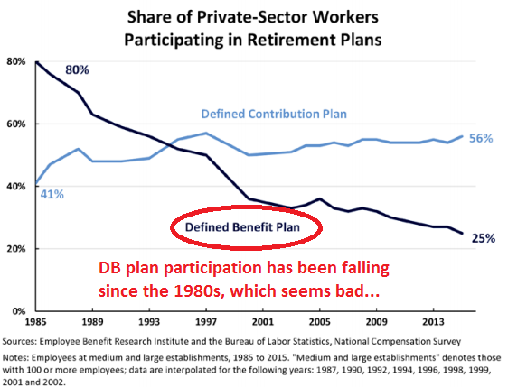
First, the graph below shows the declining share of private-sector workers who have access to a defined benefit plan. This graph comes straight from the congressional report, and I've added some crude red markings to emphasize just how dramatic this change has been. In the Democrats' telling, defined benefit plans offer workers greater retirement security, and so the decline in DB plans must also mean a decline in retirement security. This fundamental narrative is wrong--retirement plan coverage does not equal retirement benefits for workers--and as a result it's also a misread of what's happened over this time period.
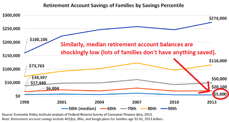
The next graph again comes straight out of the Democrats' report. They lead with the startling finding that the median retirement savings account balance in 2013 was only $5,000 (!). That's the median, and it means most American families have nothing saved for retirement at all.
That sounds really bad, and it is. But take another look at how the median has changed over time. On an inflation-adjusted basis, it dropped from $6,004 in 1998 to $5,000 in 2013. Although it's not pictured here, the same data source found that the percentage of families with retirement accounts inched up from 2013 to 2016, as did the median account balance of those plans. Regardless, it's hard to look at this graph and see any sort of golden age of retirement savings for American families. While things may not look great today, they never were. In fact, as I'll show in the next few graphs, things may actually be improving.
To focus more on outcomes, take a look the graph below from a recent report from the U.S. Census Bureau called "Do Older Americans Have More Income Than We Think?" This graph has a lot going on, but essentially the authors were looking at two sets of data. One, represented by the dark, solid lines, shows survey data, whereas the dotted and lighter-colored lines represent the authors' more complete portrait of income using administrative and tax data. On an inflation-adjusted basis, Americans aged 65 and older, of all income levels, have more retirement income than they did in the past. That trend shows up when you ask Americans in a survey, and it shows even up more when you check administrative and tax records.
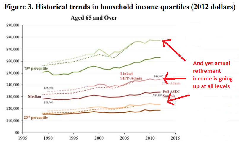
These positive outcomes are occurring at the same time as fewer and fewer Americans receive defined benefit pensions. While the decline of DB pension plans certainly didn't cause these improvements, it's notable that the American retirement landscape is improving despite the changes going on across the country.
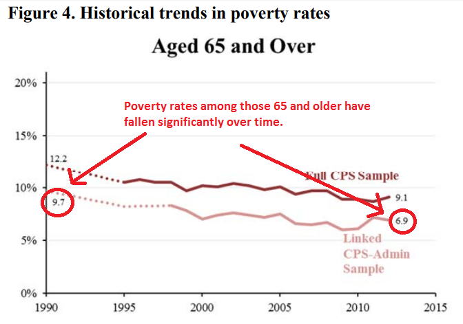
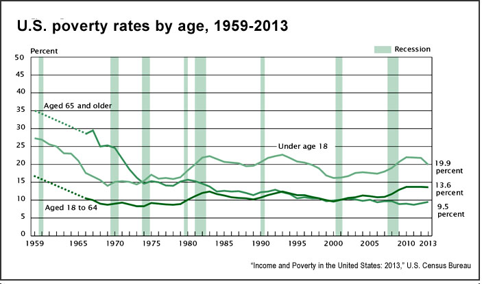
In the graphs above, there are some clear trends that retirement income is increasing faster for wealthier Americans than it is for those on the lower end. But that's likely a result of increasing income inequality, and we should be careful not to equate "inequality is increasing" with "low-income individuals are worse off." In fact, consider the next graph, again from the Census report. It shows that poverty rates among those 65 and over have fallen significantly over time.* Again, the survey data (represented by the top, darker line) is under-reporting the good news that shows up when the authors looked at actual income collected in administrative data (represented by the bottom, lighter-colored line).
In other words, the decline in defined benefit plans has not led to a decline in retirement security. If anything, the retirement landscape has actually improved a bit over time. It's theoretically possible that it's still too soon and the next generation of retirees will suffer from this change, but by now we should have seen that start showing up in the national data, and we haven't. In fact, the trends look pretty similar even if you look at recent retirees versus those who retired 10 or 20 years ago. The "Retirement Security Crisis" has been right around the corner for the last few decades, and yet it hasn't arrived.
*Meanwhile, child povery rates have barely budged over this same period of time, and the poverty rates of working-age adults (ages 18-64) are actually up a bit.
Taxonomy: