No one disputes the question of whether today's teacher pension plans are expensive to operate; they are. Many people assume that an "expensive" retirement plans must obviously translate into generous benefits for workers, but that's not always true.
If an employer contributes more money to a 401k plan, that money goes directly into workers' accounts. But that's not how most teacher retirement plans work. Under the defined benefit pension plans that cover 90 percent of public school teachers, benefits are delivered through formulas tied to the worker's years of experience and salary. Actuaries make some assumptions about how much those benefits will be worth in the future and how much is needed to save today in order to pay for those benfits, and then employers contribute the amount that's needed. That's the theory, at least, but in practice, states have accumulated $500 billion in unfunded teacher pension benefits, and so the contributions made into teacher pension plans have become more and more divorced from the actual benefits delivered to teachers.
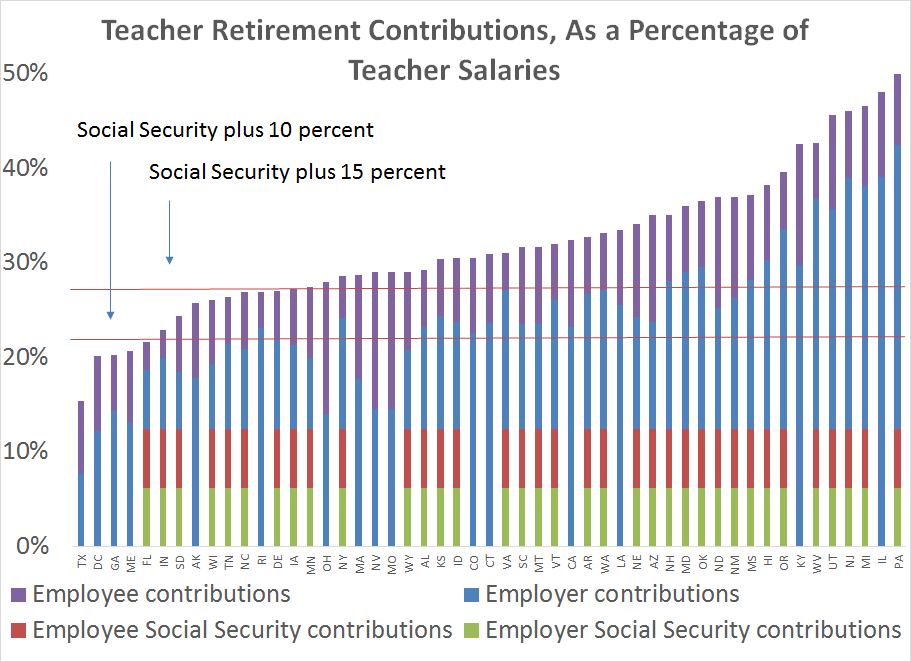
Just how divorced have contributions and benefits become in teacher pension plans? A lot! Consider the following graphs.* The first graph below shows total retirement contributions into teacher pension plans, as a percentage of teacher salaries, by state. It includes the teacher's own contributions, plus the contributions made on her behalf from her district and state (which I group together as the "employer" contribution). As the graph shows, total contributions are quite high. The horizontal red lines are pegged to experts' recommendations that workers save at least 10-15 percent of their income (in addition to Social Security). Teachers in 46 states are meeting the minimum suggested threshold, and teachers in 37 states are meeting the higher savings threshold.

This is how most people see teacher pension plans, because they equate "teacher pension contributions" with "teacher retirement benefits."
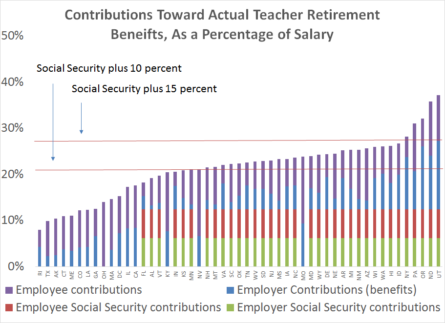
But this story is incomplete. Pension plans today are expensive, but the bulk of the costs are going to pay down unfunded liabilities, not for actual benefits for teachers. Once we take out the debt costs that states and districts are paying, the total retirement savings start to look worse. The next graph is the same as the first, but this time I've stripped out the contributions used to pay for debt. All that's left is the contributions going toward actual teacher benefits.
As before, the horizontal red lines represent the suggested contribution rates for workers to earn adequate retirement security. Looked at this way, teachers in 25 states meet the minimum threshold, but in only five states do they meet the higher target.

Now, I'll pause here to note another trend. In the private sector, all employees are automatically enrolled in Social Security, but in the public sector that's been left as a choice to the states. Notice that almost all of the states meeting the savings targets are enrolling their teachers in Social Security. Nationally, there are about 1.2 million teachers who lack Social Security coverage, and this graph helps illustrate that Social Security provides a steady, guaranteed base of benefits that states struggle to provide on their own.
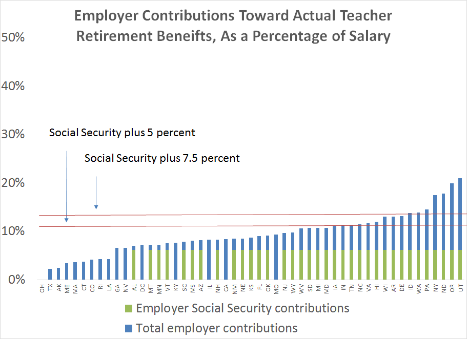
There's one more wrinkle to this discussion, which is the distribution of contributions between workers and their employers. So far, I've included all contributions from any source, but what if we limit it to employers only? State legislatures set the contribution rates for both teachers and employers, and the average state is forcing teachers to contribute about 7.8 percent of their salary toward retirement. This is perhaps a good thing--workers should save for retirement, and they wouldn't all do it on their own--but it's also relevant to know how much teachers today are being asked to pay for their own benefits.
The graph below looks only at the employer's share of retirement benefits. Here, I've tweaked the red lines representing the savings targets to assume that teachers and employers should evenly split retirement contributions. As the graph shows, states by and large are not holding up their end of the bargain. Only 15 states are meeting the lower-end threshold, and only seven are meeting the higher target. To put it another way, most teachers are getting less from their employer than if they worked for a private-sector company where workers got Social Security and a 5 percent match on 401k contributions.

Now, some people might quibble with savings thresholds I've used, or note the findings presented here hinge on states' own investment assumptions--if we assume that states are not likely to hit their aggressive investment targets, their guaranteed benefits start to look more generous. Those are both fair critiques. But it's also worth noting that what I've used here are averages across all employees in a given state. Some workers will earn benefits that much higher than the statewide averages, while most teachers will get even less.
Regardless, if states were to adopt more conservative investment targets, their liabilities would also increase, and contributions would also have to rise, and the divide between contributions and benefits would only increase. Even under current assumptions, there's no disputing that teacher pension plans are expensive, and the majority of today's teachers are not receiving the benefits of those contributions.
*Note: The data for these graphs comes from the National Council on Teacher Quality.
