How much do teacher pension plans cost? How have those costs changed over time?
Those may seem like simple questions, but there aren’t perfect data sources to answer these questions. At the national level, the U.S. Census Bureau tracks total benefit spending by states and school districts, which does include retirement costs but also includes healthcare and other employee benefits. The Bureau of Labor Statistics tracks national figures but only reports the data in terms of percentages and a per-hour basis.
Luckily, the Center for Retirement Research at Boston College (CRR) has done the yeoman’s work of collecting comparable data from state pension plan financial reports. The raw data still aren’t perfect to answer the questions I posed above—many states include teachers and other education workers alongside other public workers in the same plan—but with a little bit of work, I was able to narrow the data to look solely at teachers and other educators. (For simplicity’s sake, I’m going to use the term “teachers” throughout the remainder of the post, but the numbers also include other school support staff, principals, superintendents, and central office staff.)
With that throat-clearing out of the way, what do the numbers say?
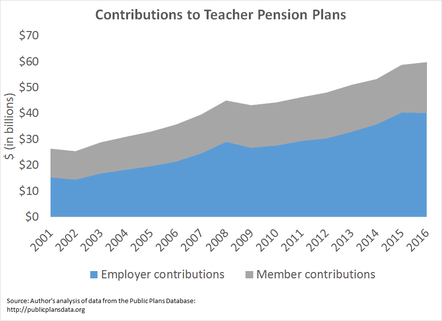
Over the last 15 years, state and district spending on teacher pensions is up approximately 261 percent. Meanwhile, states have cut teacher retirement benefits and asked teachers to pay more for worse benefits.
I’ve written about these issues recently for particular states, but it’s also worth zooming out to look at the national picture. Nationwide, states and districts now spend about $40 billion on teacher pension costs, up from $15 billion 15 years ago.* Over a period where states struggled to invest in K-12 education, rising pension costs have meant even fewer dollars making it into classrooms.
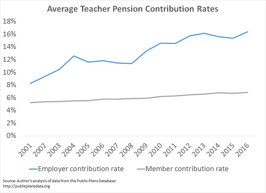
Another way to look at pension costs is to look at contribution rates. As the next graph shows, mandatory member contributions have increased over time, from an average of 5.2 percent of salary up to 6.8 percent. Again, this has happened at the same time states have been cutting benefits for new teachers. Teachers are paying more for less.
Worse, the employer actuarially required contribution rates, the rate that actuaries estimate will be needed to pay for all the future promised benefits, has doubled from 8.3 to 16.4 percent.
These graphs don’t even include Social Security. If you factor in Social Security contributions, it would appear as if teachers have enormous pots of money being set aside for their retirements.
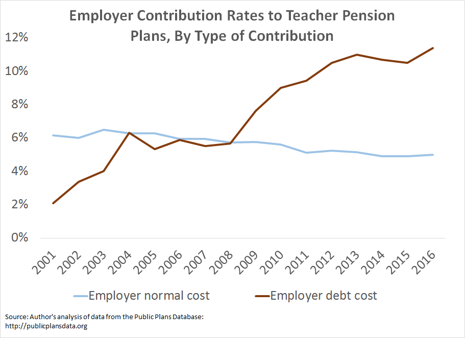
I say “appear” because that’s not how teacher pension plans work. Unfortunately, the increase in pension contributions is entirely due to paying for past pension promises that have not been adequately saved for, not to pay for actual benefits for teachers. States break down their contributions into two rates, the “normal cost” of benefits, which is the actuaries’ estimate of how much the benefits are worth on average, and the cost of paying down any accumulated debt, known as the “amortization cost.” As the graph below shows, the average normal cost of teacher retirement benefits has fallen from about 6.2 percent of salary to slightly less than 5 percent. These are averages across all members in a given plan; as states have cut benefits for new teachers, the figures would be even lower if we had accurate data about how much each of these tiers are worth.
Meanwhile, the amortization costs, aka the debt cost, of teacher pension plans have risen from an average of 2 percent of teacher salaries to more than 11 percent. To put it crudely, it’s as if states failed to make sufficient payments on their credit cards or their home mortgage, and now their interest costs have ballooned.
These costs will not go away any time soon, and states will need to think differently if they want to see any future changes. Left unaddressed, the mountain of debt is likely to keep growing, and teachers will see more and more of their compensation going toward paying off past pension debts instead of going into their pockets.
*Note: The numbers in this post are meant as estimates. They start with data from the Public Plans Database, with a few adjustments. About half the plans in the database include educators and non-educators alike, so in order to get a closer estimate of the education share, I applied weights used by the National Council on Teacher Quality which are based on the percentage of each plan’s membership who are educators. For most states, the data run from fiscal year 2001 through fiscal year 2016, but data were not available for all states and all years. A few states were missing random years of data, in which case I used the average of the years before and after. I took out Kentucky entirely, since it was missing all years prior to 2014. And a couple states, notably New Hampshire and Oregon, were missing data for the earliest years in this time period. For those states, I simply applied the later rates going backwards.


