
Chris Lozier has served as CFO and COO of several education organizations, including the 2,500-student Chicago CMO Civitas Education Partners. His obsession for data analytics is deeply rooted in his experience serving underwater in the 1990s as a nuclear engineer and submarine officer.
There are two broad ways we might better inform the American public and, more importantly, the pensioners to whom critical promises have been made. One way would be to assess factors that threaten the sustainability of these pensions but which are not already accounted for by the pension accounting and actuarial assumptions on which almost all reporting, conjecturing, and debate are based (e.g., states’ financial health, churn rates among teachers, and others…more on that later).
Another way to move the conversation forward would be to simply tell the story of pension data in a way that might make more sense to non-accountants, non-actuaries, and other laypeople who don’t get paid to understand the complicated math, the accounting magic, or the inconsistent policymaking. This category comprises most everyone.
One simple metric might accomplish the latter and help describe states’ relative pension challenges in a way that is easier for most of us to understand and appreciate. Rather than talking about funded percentages or by how many billions of dollars a state’s obligations exceed its assets, what if we could measure a state’s funding shortfall in terms of current employees?
It turns out we can with the help of a few basic numbers from the Boston College Center for Retirement Research and the U.S. Census Bureau’s 2012 Survey of Public Pensions. Using unfunded actuarial accrued liability (UAAL) from the former and covered payroll and membership data from the latter, we can arrive at an understandable metric for each state:
The number of average pension member salaries needed to close the gap
and fully fund the average obligation made to all pension members
I’ve dubbed this “current average salaries to obtain full funding per pensioner,” or CAST-OFFs per Pensioner.
The map below shows CAST-OFFs per Pensioner by state. The darker states reflect a higher number of CAST-OFFs and a worse financial position.
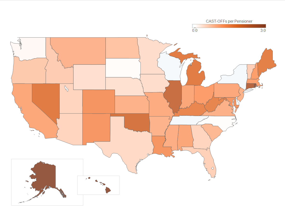
What does this map tell us in plain English? In Illinois, for example, the average FY12 payroll per active pensioner was about $50,000. Meanwhile, the state-administered plans were underfunded by about $110,000 per plan member. Therefore, Illinois’ average pension debt per plan member is as large as the salaries of 2.2 average active pensioners. Put another way, the average Illinois state pension fund member could have the promise that’s been made to him or her fully funded if one average active member would contribute his or her entire salary to the pension fund for 2.2 years.
The state-by-state coloring of this map will not significantly differ from similar maps describing the funded status of states. However, these numbers can help interested observers better appreciate “how far behind” states are in being equipped to make good on their promises simply by putting this shortfall in terms that carry greater intuitive meaning.
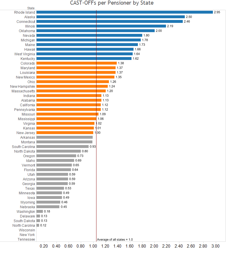
This method has the added benefit of incorporating a normalizing effect by accounting for the average salary of active pensioners. It would be easy to think, “if current salaries are higher then, all else being equal, the liability will end up being higher.” This is true but this should be accounted for in the UAAL. By bringing average payroll into the denominator, we’re effectively saying the obligation relative to the current cost of the active pensioners is less in this scenario.
For active pensioners who may be years away from taking money out of the pension system, a feel for how many average salaries their state has fallen behind might raise awareness and even lead to greater action from within.
--Chris Lozier
Taxonomy: