Stock markets are hitting new highs (in nominal dollars) and pension plans have now earned positive returns in six straight years. But while this is good news, it's worth pausing a moment to note that by some measures the current stock market is as expensive as it has ever been. Past returns are no guarantee of future results, but pension plans should be concerned that one of the strongest and longest bull markets has not been sufficient to restore plan funding. The four graphs below help provide some historical perspective:
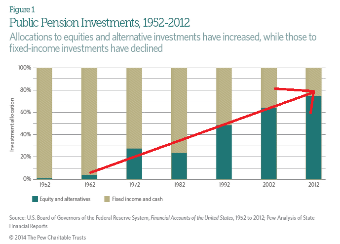
1. Pension plans didn't always take risks on stocks or private investments. The first graph, from the Pew Charitable Trusts, shows the rise in pension risk-taking. Starting in the 1970s and accelerating in the 1980s and 90s, pension plans invested higher and higher percentages of their assets in stocks (equity) and other alternative investments. This bet works well during bull markets but leaves pension plan funding levels much more vulnerable to bear market declines. On the positive side, it led pension plans to be fully funded by the end of the dot-com bubble but subsequently led them to crash twice in the last 15 years. But there is a steep downside--pension plans are more dependent on strong investment returns than ever before.
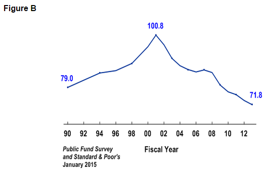
2. Pension funds have not rebounded from recent stock market crashes. The most recent data on large state and local public pension plans from the Public Fund Survey, a compendium of data on large state and local pension systems, suggests that pension plan funding levels are closely linked to stock market returns. After the aggregate funded ratio topped 100 percent in the early 2000s after the dot-com boom, benefit increases and two economic recessions caused a strong reversion. Today, even with recent stock market increases, pension plan funding levels haven't even begun to recover.
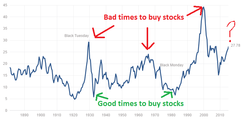
3. There are better and worse times to buy stocks. Now seems like a bad time. Pension plans assume 7.5 or 8 percent returns every year, but in reality stock markets tend to be uneven. While no one can confidently time the stock market, there are historical indicators of good and bad times to buy stocks. It was a bad time to buy in 1928 and 1929. The 1970s weren't a great decade for investors. And 1999 was a terrible time to buy stock, especially of technology companies. You may remember what happened to investments during the financial meltdown in 2007-9.
The chart below tracks a ratio known as the Shiller Cyclically Adjusted Price Earnings (CAPE) ratio. While the CAPE is not necessarily a strong predictor of short-term outcomes, it uses 10 years of inflation-adjusted earnings data to provide useful historical comparisons. On this average, market-wide, long-term basis, stocks are now more expensive than they were in 2007 and more expensive than any time other than 1929 or 1999.
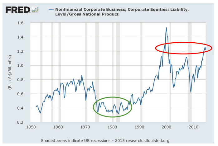
4. Stocks are now valued more than the entire U.S. Gross National Product. There are multiple ways to value the stock market. Legendary businessmen and investor Warren Buffett likes to use the total aggregate stock market capitalization divided by Gross National Product (or GDP). When this indicator rises above 1.0, it means investors are valuing the stock market more than the total goods and services produced within the country. We've only been above 1.0 three times--in the late 1990s, just before the 2007 meltdown, and today. Needless to say, the first two times were decidedly NOT good times to buy stocks.
The chart below shows the long-term trend of this indicator. The green circle represents a pretty good time to buy stocks. (Incidentally or not, this roughly lines up with when pension plans began investing more heavily in equity markets.) The red circle represents today's elevated levels. Again, this measure says little about where the stock market will go in the next few months or even years. That said, elevated levels on this indicator have historically been associated with poor returns in the future.
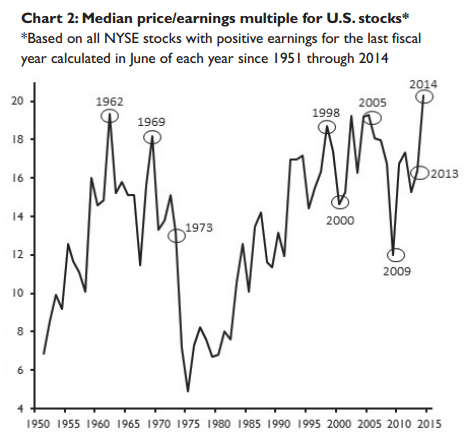
5. The median stock is more expensive than ever. As the NASDAQ index of technology stocks reaches its 2000-era peak, there have been a number of stories comparing the top companies from 15 years ago versus the top companies today. In short, many of the leading companies in 2000 had very small earnings, whereas today the index is led by extraordinarily profitable companies like Apple. That's an important point, except that we can't all just invest in the "best" companies. Markets are made up of a wide variety of companies, not just a few high-fliers. And even if you (or a pension plan) could accurately identify the best investments, these companies might be vulnerable if the entire market goes down.
So another way to look at market valuations is to consider the median stock, the company that sits right in the middle of the market. The graph below shows the price/ earnings ratio for the median stock listed on the New York Stock Exchange (NYSE) for every year from 1951 through 2014. On this measure, the market is actually more expensive than any time in the last 65 years. We're also at or near all-time highs for the median stock almost no matter what financial aspect you look at (in terms of assets or the amount of cash they bring in).
All of this should terrify pension plans (not to mention other investors). Now is probably not a good time to take on risky pension obligation bonds, reduce contribution rates, or expand benefits. Who knows when the next stock market crash will come or how steep it will be, but it is inevitable. Pension plans should be prepared.
Taxonomy: